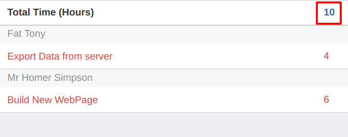
Timesheet App report allows users to regulate and monitor jobs assigned to them.
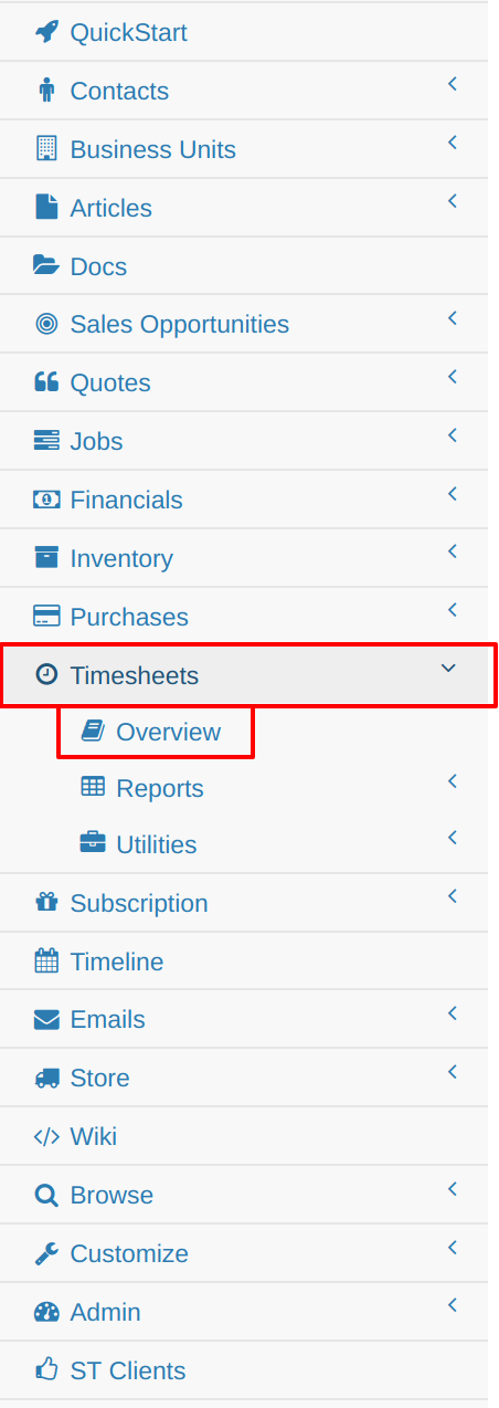
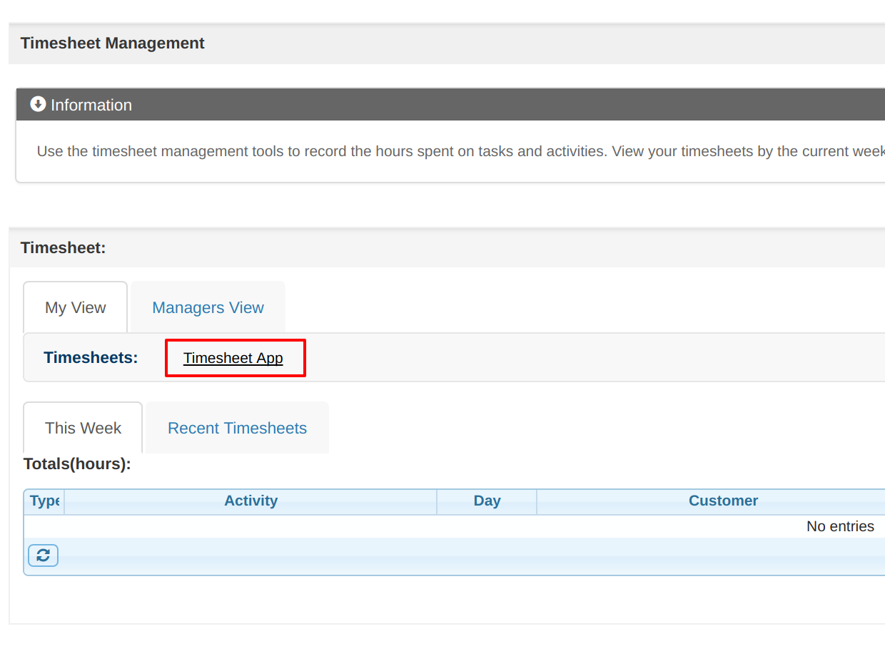
The Timesheet App is located under the Timesheets tab in the control panel. Clicking on Overview and then the Timesheet App link will cause a pop-up taking you to the application.
The Timesheet App has 3 views:
The Calender view is laid out in a typical calendar format showing the day, month and year.
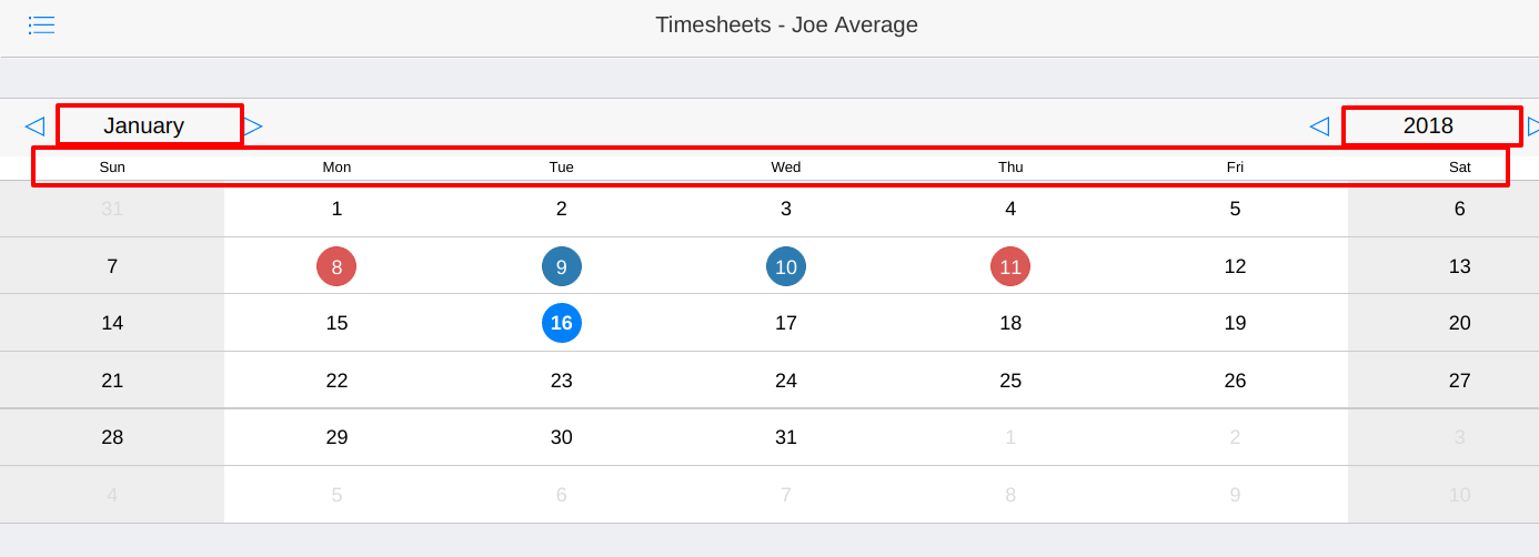
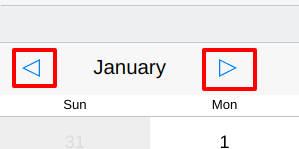
You can navigate by clicking on a different day. Changing month or year is done by clicking the arrows either side of the table. These buttons are located just above the days of the week. Clicking on the right arrow will go forward a unit and left to go back.
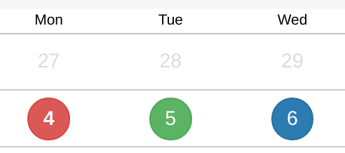
Having time set against a task will change the color of the date. If less than 8 hours has been entered for a day a red circle around that date will Appear.
Note* Red circles do not Appear in future dates as time shouldn't be added to those dates yet. This is also true for weekends as time is not expected to be entered on these days
Customization: All color coding can be customized according to an organizations needs on request. The below colors are default settings.
Color code:
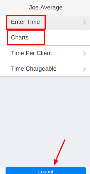
The utility bar is located on the top left of the App accessed by clicking on the Tab icon. Any user has access to their own Timesheet along with the chart views. The sign out button is also located on the bottom of this pop-up if you wish to switch users.
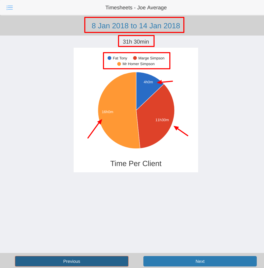
Time Per Client Chart can be accessed by clicking on the Time Per Client Tab. This chart shows an overview of times entered for the week in a simplistic, easy to read pie-graph. The graph is segregated into parts each showing time entered against each client for that week. The chart displays:
If no time has been entered for that week, a notification will pop-up informing you of the absence of data.
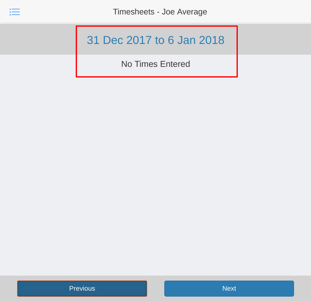
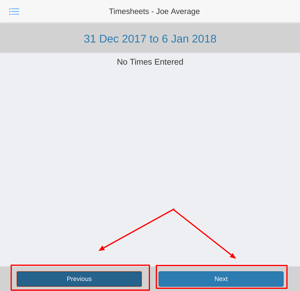
Navigation of weeks can be done by clicking the 'Previous' and 'Next' button located at the bottom of the App.
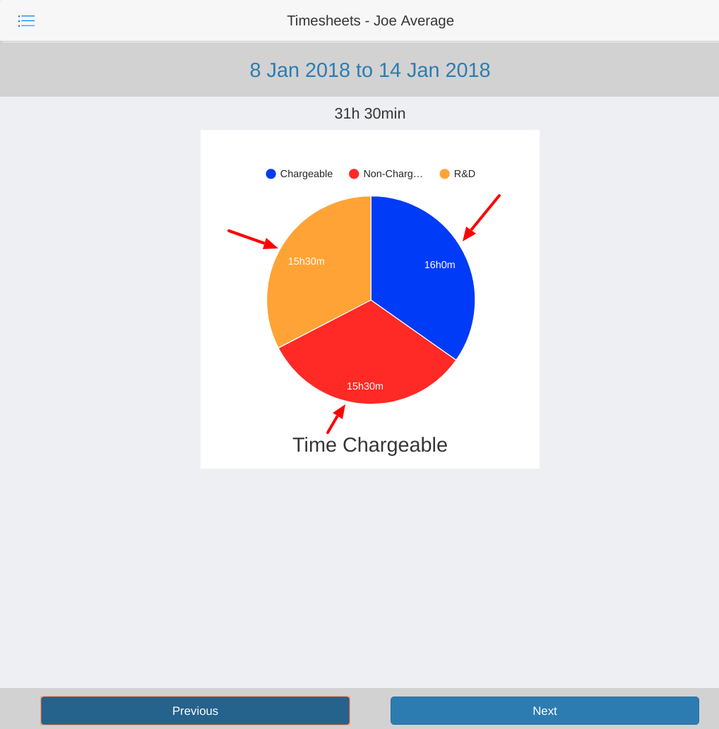
The Time Chargeable Chart can be accessed by clicking on the Time Chargeable Tab. The layout of Time Chargeable Chart is similar to the Time Per Client Chart. It shows the amount of time spent working on Chargeable, Non-Chargeable and RnD tasks. This is displayed in an easy to view pie-graph and is color-coded in the following layout:
Chargeable = Blue
Non-Chargeable = Red
R&D = Orange
To Enter the Data View, click on a date you want to view and/or edit on the calender view screen.
The Data entry screen lists all tasks assigned to the individual on that day. The date selected and the current user will be show at the top of the window.
The Client name and Task name is located on the left side of the window. Time already placed against each task is on the right side.
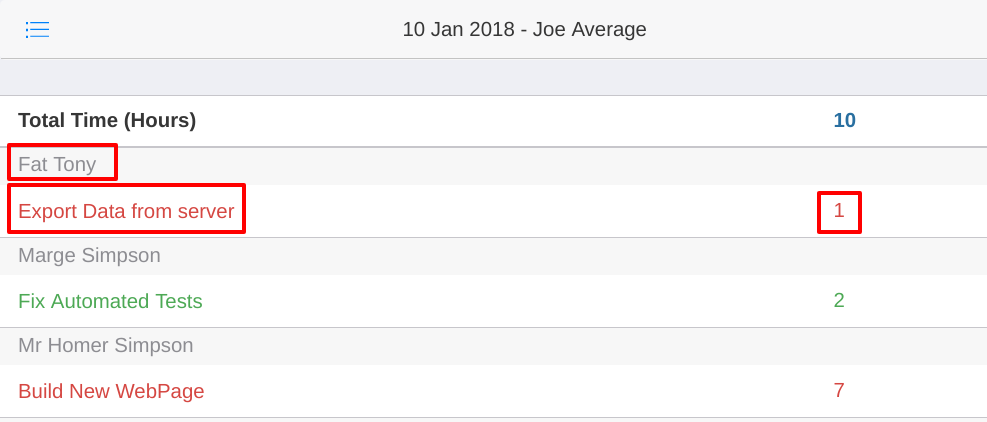
Clicking on the name of the task will open a separate window showing the specifics of the task and the data entry screen.
Entering time against a task in the data entry screen automatically sync with the time Timesheet App. The same will occur when entering a time via the Timesheet App, entered times will appear pm task screen.
Entering time for a task in the Timesheet App can be done in 2 ways:
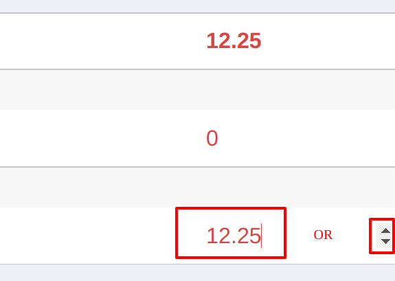
When a time is entered against a chargeable task the number inline with the task will change color accordingly.
The task below is a chargeable task set for 20 hours showing the color change as more time is recorded
Example Black:
![]()
Example Orange:
![]()
Example Red:
![]()
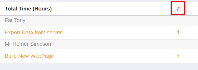
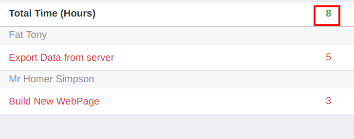
When a time is entered against a task the total hours for the day, located at the top, will change color. Each color shows the following:
Red Example:
Green Example:
Blue Example:
